India's national bird is the Indian peacock (Pavo cristatus), and drawing one that actually looks like a peacock comes down to three things: getting the proportions of the body right, building the tail fan with guide lines before you add any detail, and rendering the iconic eyespots (ocelli) with layered rings rather than flat circles. Once you understand those three principles, the rest follows naturally.
How to Draw India’s National Bird Peacock Step by Step

Marcus Chen
9 Jun 2026
The bird you're drawing: the Indian peacock
India officially designated the Indian peafowl as its national bird in February 1963. The choice made cultural and visual sense: the peacock has been woven into Indian life for millennia, appearing in Hindu iconography (Krishna is traditionally depicted with a peacock feather in his crown), Mughal art, and classical dance. It is also simply one of the most visually striking birds on the planet, which makes it a rewarding subject to draw.
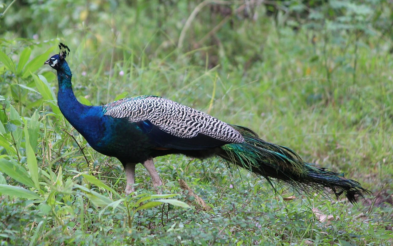
Before you pick up a pencil, get these key visual features locked in your mind. The male (the one everyone pictures) has a deep iridescent blue-green head and neck, a fan-shaped crest of stiff upright feathers, a small white patch below each eye, and a slender, upright posture. The 'tail' that fans out behind him is technically the upper tail covert feathers, a train of roughly 200 elongated plumes that can reach about 5 feet (1.7 m) in length. Each plume ends in an ocellus: a layered eyespot ringed with blue and bronze on a background of shimmering green-bronze. The tutorial also uses the term “ocellus” to name the eye-spot components in peacock feather patterns. That ocellus pattern is the single most recognisable thing about the bird, so most of your drawing effort will go there.
References and tools to gather before you start
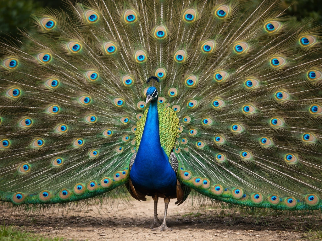
A good reference photo makes every step easier. Search for a male Indian peacock in full display (train raised and fanned). Look for a shot that shows the bird face-on or at a three-quarter angle so the fan's symmetry is visible. The Smithsonian National Zoo and National Geographic both have high-quality reference images that clearly show the ocelli structure and the bird's posture.
For materials, you do not need anything expensive to start. Here is a simple kit that covers both sketching and detail work:
- Pencils: HB for initial construction lines, 2B for mid-tones, 4B or 6B for dark feather centers and shadows
- Smooth cartridge paper or Bristol board (smoother surface gives cleaner feather edges)
- A good eraser: kneaded eraser for lifting graphite cleanly, vinyl eraser for hard corrections
- Blending stump (tortillon) for smoothing graphite across the tail area and creating soft gradations
- Optional: coloured pencils in phthalo blue, cobalt blue, bronze/copper, and dark green for the ocelli — keep them very sharp for detail work
If you are drawing digitally, the same workflow applies: sketch layer for construction, detail layer for feathers, a separate layer for ocelli rings so you can adjust them without redrawing everything.
Step-by-step sketch: proportions, head, body, and pose
Start with a light construction sketch. Do not try to draw the peacock fully rendered from the start, build it up in stages. The construction phase is the most important part of the whole process.
- Draw a small oval for the head. The peacock's head is compact relative to the body, roughly the size of a large egg.
- Below the head, draw a long, slightly curved S-shaped line for the neck. The neck is slender and holds the head high and proud — that upright posture is part of what makes a peacock look like a peacock.
- Draw an oval for the body, roughly three times the height of the head oval. Place it below and slightly behind the neck base. The body tilts forward slightly at the breast.
- Sketch in the legs with simple lines: they are long, straight, and the bird stands firmly. Even if the legs will be partially hidden by tail feathers, knowing where they are keeps the stance grounded.
- Add the fan-shaped crest on top of the head: a loose cluster of thin lines, each topped with a tiny dot or teardrop shape. The crest splays upward and slightly forward.
- Mark the white eye patch as a small almond shape just below where the eye will sit. This is a quick detail that immediately makes the head recognisable as a peacock.
At this point your sketch should look like a rough bird silhouette. Resist the urge to tighten it up or add feather detail yet. The proportions need to be right first. Compare your construction to your reference: is the body large enough relative to the head? Is the neck long enough? Adjust now while everything is still light and loose.
Drawing the iconic tail fan and feather structure
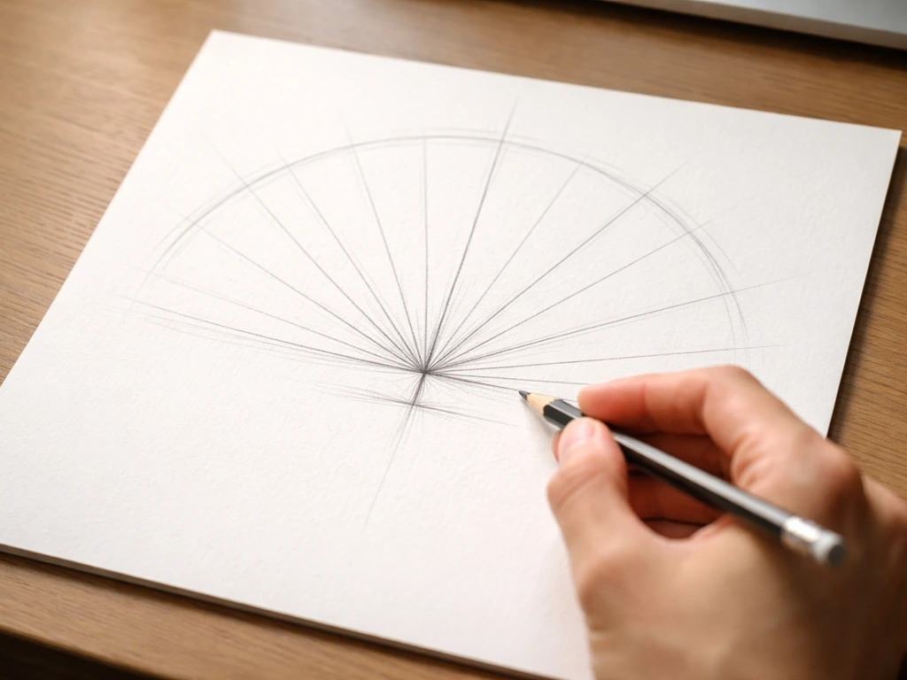
The tail fan is where most people either succeed or struggle. The key technique is to draw the scaffold before you draw any individual feather. This matches the tutorial guidance to sketch the axes of the tail early so you build the tail fan direction with construction axes before detailing the feathers draw the scaffold before you draw any individual feather. If you skip this and go straight to feathers, the fan ends up lopsided or the feathers bunch in the wrong places.
- From the base of the body (just above the tail), draw a large fan or half-circle arc in very light pencil. This marks the outer boundary of the train. Think of it as a pizza-slice shape that radiates from the bird's lower back.
- Inside the fan boundary, draw evenly spaced axis lines radiating outward from the base point, like spokes on a wheel. These are your feather-direction guides. Aim for around 12 to 16 lines across the full spread — you do not need to draw every feather, just set the even spacing now.
- Along each axis, sketch a loose feather shape: a thin central stem (rachis) with a slight curve, and soft, wispy barbs spreading out to both sides. Peacock train feathers are not like normal wing feathers — they are very fine and almost hair-like except at the ocellus tip.
- At the end of each stem, lightly draw an oval placeholder for the ocellus. Keep these ovals the same relative size and spaced evenly. The fan should look symmetrical across a vertical centre line drawn through the bird's spine.
- Once all the axis lines and oval placeholders are in, you can go back and add the fine barb lines along each stem using light, feathery strokes.
The symmetry of the fan is critical. A real peacock's display is perfectly mirrored, and your eye immediately notices when it is off. After laying in the axis lines, hold your paper up to a light source or mirror to check the balance before adding any detail.
Rendering the ocelli: the eyespot pattern in detail
Each ocellus is a layered structure, not a flat circle. Working from the centre outward, the rings go roughly like this: a dark brown-black centre point, then a ring of blue-green iridescent colour, then a bronze-copper ring, then the outer feather barbs. In graphite, you translate this into values: dark centre, mid-grey ring, lighter grey ring, then the fine barb lines fading out. In coloured pencil, use phthalo or cobalt blue for the main iridescent ring and a warm bronze or copper for the outer ring.
The technique that works best is to layer from dark outward. Start with the darkest centre and build rings of progressively lighter tone. The key mistake to avoid is making each ring a perfectly clean, even border. Real ocelli have a slightly irregular, organic edge on the inner rings, which is part of what makes them look alive rather than printed. Add a tiny bright highlight at the top of the ocellus (use your kneaded eraser to lift graphite, or preserve the white paper in coloured pencil) to suggest the iridescent sheen.
One practical tip for coloured pencil: keep your pencils very sharp when working on ocelli, and work in a tapping or stippling motion with light cobalt blue to suggest the random sparkle of iridescence around the ring. Preserve the white of your paper wherever you want the brightest iridescent colour to appear, once you lay down colour over those areas, you cannot easily recover that brightness.
Adding realism: shading, texture, and the head details
The head, eye, and beak
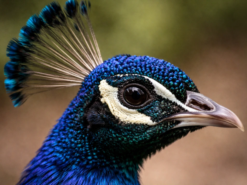
The peacock's head is one of the most detailed parts of the bird. The eye is small, dark, and sits high on the head. Surround it with the white facial patch below and the metallic blue-green feathering above. When drawing the eye itself, apply the same layered-ring logic you used for the ocelli: a very dark pupil, a slightly lighter iris ring, and a tiny white specular highlight. The beak is short, strong, and slightly hooked at the tip, more like a game bird than a songbird. Draw it with confident, clean lines rather than sketching it tentatively.
The crest feathers deserve care: each wire-like stem ends in a small spatula or teardrop shape. Draw them as individual lines with tiny droplets at the tip, not as a vague fuzzy mass. Getting this right adds a lot of character to the head.
Shading the body and neck
The neck and breast feathers have a dense, almost scaly texture because of the tight feather arrangement. Use short, slightly curved strokes following the direction of the feathers (downward and slightly outward from the centre line). Shade the underside of the body and under the neck with a 4B or 6B pencil, and use a blending stump to smooth the transitions. Leave the breast and upper neck relatively light since those areas catch the most light when the bird is in display posture. A bit of negative drawing (using your eraser to pull out lighter shapes within a shaded area) works well for the fine breast feathers.
Common mistakes and how to fix them fast
| Mistake | Why it happens | Quick fix |
|---|---|---|
| Tail fan looks flat or lopsided | Skipping the axis guide lines and drawing feathers freehand | Erase and redo the fan scaffold: half-circle boundary first, then evenly spaced spokes before any feather detail |
| Ocelli look like flat, uniform circles | Filling the eyespot with one consistent tone instead of layering rings | Re-work with layered values: dark centre, mid ring, lighter outer ring, and a lifted highlight |
| Head looks too large or body too small | Misjudging scale at the construction stage | Compare head oval to body oval in your construction sketch and scale up the body before adding any detail |
| Feathers look muddy and indistinct | Using too much blending and losing the fine barb lines | Use the blending stump only on broad tonal areas; draw individual barb lines on top of blended areas with a sharp pencil |
| Neck is too short or too straight | Drawing it as a simple straight line rather than an S-curve | Redraw the neck as a gentle S, longer than feels natural — the peacock's neck is unexpectedly elegant and elongated |
| Fan symmetry is off | Not checking the centre axis before adding detail | Lightly draw a vertical centre line through the body spine and the fan before placing any ocelli; use it as a mirror guide |
A simple practice plan to get better quickly
The biggest jump in quality usually comes from doing a few quick throwaway sketches before attempting your final drawing. Here is a practical workflow you can complete in a single sitting or spread over a few short sessions:
- Warm-up gestures (10 minutes): Set a timer and do three or four 2-minute sketches of the peacock's overall silhouette and stance from your reference photo. Do not draw any tail detail — just the body shape, neck, and pose. This trains your hand to get the proportions right before you spend time on details.
- Thumbnail the fan (10 minutes): Do two small thumbnail sketches (credit-card size) of just the tail fan, focusing on the axis-line scaffold and the placement of ocelli ovals. You are not rendering, just planning spacing and symmetry.
- Single feather study (15 minutes): Draw one isolated peacock train feather at larger size, from stem to ocellus, working through the full layering sequence for the eyespot. This is your test run for the ocelli technique before you apply it to 12 or more feathers in the full drawing.
- Full drawing (as long as you need): Now bring it all together. Construction sketch, tail scaffold, feather detail, ocelli, then head and body shading. Do not rush the scaffold stage — every minute spent on guide lines saves five minutes of correcting later.
- Iteration: After finishing, identify the one thing that looks least right and do a focused redraw of just that element. Repeat this across two or three sessions and the improvement compounds fast.
If you enjoy drawing national birds as a subject, the peacock is one of the more complex ones to master because of the tail, but the same scaffold-first approach works well for other birds too. If you want another national-bird comparison, look up what is the national bird of bangladesh and how it relates to the country’s wildlife identity. Nepal's national bird, the Danphe (Himalayan monal), has similarly iridescent plumage and rewards the same layered-ring technique for rendering its metallic colours. Pakistan's national bird is the great bustard, a distinctive bird found in parts of the country Nepal's national bird. The principles you practise on the peacock transfer directly.
The peacock was chosen as India's national bird because it represents the country's natural richness, its deep cultural and spiritual heritage, and frankly because no one who sees a peacock in full display forgets it. The national bird of Jammu and Kashmir is the Kashmir stag, also known as the hangul. The chakor is the national bird of Pakistan, and its presence in local habitats has made it an important symbol of the country’s natural heritage. Your drawing should try to capture exactly that quality: a bird that is impossible to overlook. In case you are wondering, West Bengal's national bird is the Bengal florican (lesser florican) beyond the peacock. Nail the tail fan symmetry, layer those ocelli properly, and keep the posture upright and proud, and your sketch will be immediately recognisable as the national bird of India.
FAQ
How do I keep the peacock’s tail fan symmetrical if I’m drawing from imagination?
If you want a more realistic look, pick a reference where the tail train is fully raised, then copy the fan as one mirrored unit: draw a central axis, place the first few ocelli near the center at the correct spacing, and only then fill outward. If your ocelli spacing gets uneven, stop and re-check the fan scaffold before adding more detail, because later rings will inherit the same tilt and gaps.
Can I draw the Indian peacock without a full tail display, like a standing bird?
Yes, but you still need construction. Sketch a simple “T” posture (upright body line, raised tail line), then compress the tail train into fewer visible plumes. Place ocelli only on the plumes you actually see, and make the outer rings larger and lighter only where the plumes face the light, otherwise the drawing looks like a flat pattern laid over a folded fan.
What’s the easiest way to get realistic depth in the ocelli using graphite values?
Make a quick values map first: center ocellus should be darkest and highest contrast, inner rings mid-tone, outer rings lighter with softer edges. If you darken the outer rings too much, the ocelli lose the “recessed” depth effect. A practical check is to squint at your drawing, if rings all look the same grey, add stronger value steps from the center outward.
My ocelli look like perfect circles. How do I avoid the “printed sticker” look?
You can, but keep the edge irregular. Use a light underdrawing of the ocellus outline, then build rings with short strokes that vary slightly in thickness and break up any perfectly clean contour. Also, avoid making the highlight only one dot, instead preserve a small curved white area (paper white or lifted graphite) near the top of the ring to catch the iridescence correctly.
What should I do if one side of the fan tilts upward or downward?
If the fan looks lopsided, the problem is usually the axis and spacing, not the feathers. Draw two faint guidelines across the fan, one for the plume direction and one for the height of the top of the crest line, then mirror your ocelli placement on both sides before you add any individual feather bars. Use a mirror or hold the page up to light before committing to dark details.
How can I make iridescent blue-green and bronze tones look vibrant instead of muddy?
For graphite, you can create the sheen by preserving bright paper highlights and then layering darker tones right up to (but not over) those highlights. For colored pencil, lay down the cobalt or phthalo ring first, then glaze a warm copper/bronze outer ring lightly, and finally add tiny sparkle with very sharp tapping marks. Don’t overblend the rings, blending flattens the iridescence.
How do I draw the peacock’s small eye without it disappearing into the head?
Start with the darkest pupil, then add a thin iris ring, then the specular highlight. Avoid shading the entire eye as a smooth oval. The eye should read as a small, sharp focal point, so keep surrounding facial areas lighter and use only minimal graphite pressure around the eye to prevent it from blending into the head feathers.
What’s the most common mistake when drawing the crest feathers, and how do I fix it?
The best approach is to draw the crest as individual stems with consistent spacing, but vary the curvature slightly so it feels organic. Keep the tips smaller and sharper than the base, and connect the crest to the head with short overlapping feather “bases.” If your crest becomes one fuzzy mass, you lose the delicate wire-like look.
How do I get the scaly texture on the neck and breast to look directional, not messy?
A quick “feather direction” rule helps: strokes on the neck and breast should curve along the feather growth, generally downward and slightly outward from the center line. If your strokes go in random directions, the texture feels chaotic. For the scaly density, use short strokes and build from lighter to darker, leaving some highlights on the upper neck and breast.
How should I practice before starting a final peacock drawing?
Do a 10-minute warmup with the same pose before your final: one sketch to get body proportions, a second to practice the fan scaffold, and a third to place ocelli only (no feather bars). This reduces frustration because you separate the hardest decisions (layout) from the later rendering work.